Why is Minimalist Logo Design so Popular?
Minimalism is a topic that has been discussed and debated for many years in the design community. Minimalism in logo design gained popularity in the 1960s and 1970s. This movement was largely influenced by the Swiss Style, which emerged in Switzerland in the 1950s and was characterized by clean, minimalist designs. The simplicity of the style and the emphasis on functionality and legibility became popular among designers and businesses seeking to create distinctive and memorable logos that could be easily recognized and reproduced in a variety of contexts. Some well-known examples of minimalist logos from this period include the logos for IBM, UPS, and ABC. Since then, minimalism has remained a popular approach in logo design, with many designers continuing to embrace the style and create new and innovative minimalist logos.
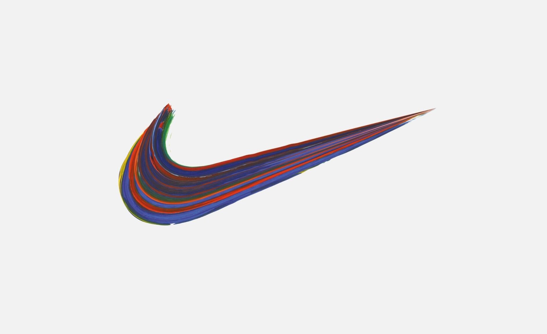
Some of the most iconic minimalist logos include Nike’s swoosh, McDonald's golden arches and Apple’s half-bitten apple. Many designers continue to explore the possibilities of minimalism in logo design, seeking to create logos that are simple, timeless, and effective. Some designers argue that minimalism is the most effective approach to logo design because it allows for greater clarity and visual impact, while others believe that more complex designs can also be effective in certain contexts.
So, why is minimalist logo design so popular? In this blog post, we will explore some of the reasons behind the trend.
1. Simplicity in Logo Design is Key
Simplicity is often considered a crucial element of effective logo design. Achieving simplicity in logo design can be a real challenge, as it requires careful consideration of each element in the design. Minimalist design is all about simplicity. This means that minimalist logos are often straightforward, uncomplicated and easy to understand. One meaning, one stylistic approach. This simplicity makes it easier for customers to recognize and recall the logo. Simple shapes and typography make for an instantly recognizable and memorable design that is effective across various marketing channels.
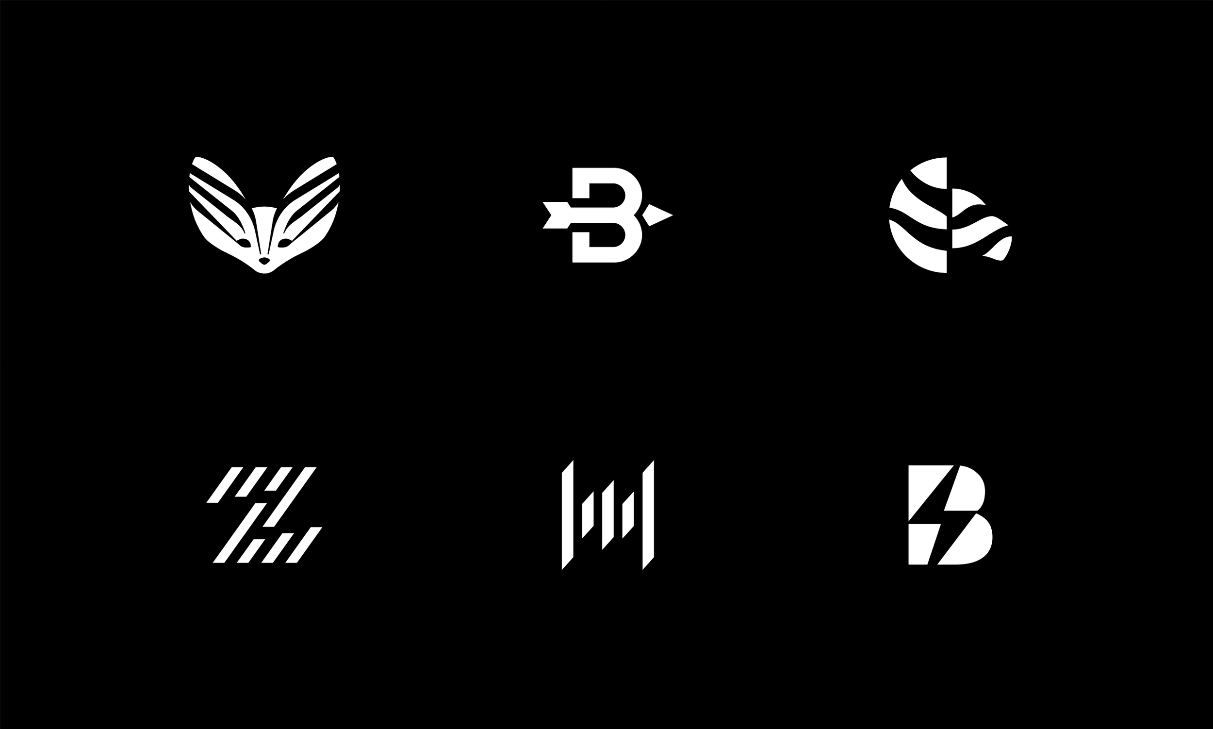
Minimalist logo design for an architecture & drafting company.
2. Minimal Logos are Versatile and Adaptable
Another reason why minimalist logo design is so popular is because it is indeed versatile, scalable and adaptable. Minimalist logos can be easily adjusted to fit different contexts, making them ideal for branding purposes. They can be used in a variety of sizes, colors, and backgrounds, making them flexible and adaptable to different media. This versatility ensures that the brand remains consistent across various platforms, from huge banners to a logo favicon.
3. Timelessness
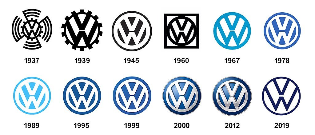
Timelessness in logo design refers to the ability of a logo to remain relevant and effective over a long period of time. Minimalist logos are often timeless because they are stripped down to their simplest form and do not rely on trends or complex designs that can quickly become outdated. Logos that are truly timeless have remained largely unchanged over time and continue to be recognized and valued by consumers around the world. A great example of this is the logo of Volkswagen, which remained largely unchanged once they simplified it in 1945.
4. Consistent Branding
A minimalist logo design can help convey a consistent brand message that resonates with your target audience. As minimalist logos tend to be simple and easy to reproduce, they can be easily used across a variety of platforms, from social media to print advertising. The simple design reinforces the idea of a brand as being professional, confident, and straightforward. Consistent branding is important because it helps to create a strong and recognizable brand identity, which can help to build consumer trust and loyalty. By using a minimalist logo as the foundation of a brand's visual identity, companies can ensure that their branding is consistent and cohesive, no matter where it appears.
5. Elegant and Distinctive
Last but not least, minimalist logo designs can be distinctive because they stand out from the noise of complex designs and bright colors, making it easier to differentiate the brand from its competitors and create a memorable and recognizable visual identity. A minimalist design can be a statement of sophistication and elegance. The deliberate and selective use of space, typography, and color all come together to create a design that is both impactful and memorable.
In conclusion, the popularity of minimalist logo design is likely to continue in the years ahead. Simplicity, versatility, timelessness, consistency, elegance and distinctiveness all contribute to the appeal of minimalist design. As businesses strive to communicate their brand message with clarity and precision, minimalist design will continue to play an essential role in effective branding.
. . .
If you like what you read, visit my logo & brand identity design portfolio site, and follow me on Behance, LinkedIn and Instagram.
_format-1500w.png)


